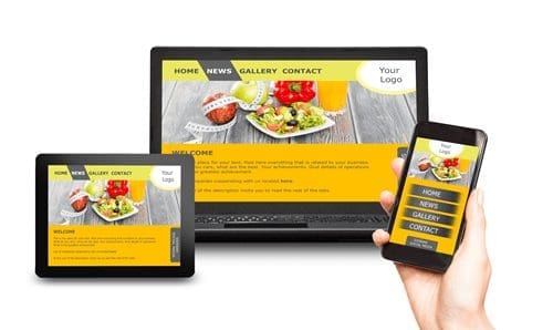
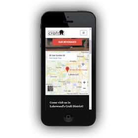
Better question is, how responsive does it NEED to be? Spoiler alert: your customers don’t want to have the same experience visiting your website on a desktop versus mobile device. When we introduced website best practices for the craft beverage industry last month, subscribers emailed asking for more guidance on mobile. In this newsletter you’ll find the playbook needed to get mobile right for your business. But first, have you seen your website on an Apple iPhone 5 lately? MobileTest.me is a free service that allows you to test your web apps and websites on all popular smartphones and tablets. Try different devices…now you’re seeing your website from the eyes of your [potential] customer. Scary? Read on!
mobile-friendly versus responsive
 To say not all mobile websites are created equal is an understatement. Websites can look amazing on mobile but fall flat on the desktop. Long-form content, like your origin story, doesn’t always lend itself to swiping on a phone. And don’t get us started on photography and video with their bloated file sizes and download times! It’s hard enough to design a craft beverage website you’re excited about, let alone to worry about it being viewable on every device, right?
Let’s clear up some confusion, some of which we’ve probably caused. There’s a difference between “mobile-friendly” and “responsive” web design. We’ve used the term mobile-friendly a little more loosely in newsletters than we should. Understanding the difference is critical to deciding how much time and money to spend on mobile.
There’s a time-tested article by Oto Hlincik on the topic. In summary:
- A mobile-friendly website is one that is designed to work the exact same way across devices. This means that nothing changes or is unusable on a computer or mobile device.
- A responsive website is one that responds (or changes) based on the needs of the users and the device that they’re viewing it on.
How do you know what you need? If your website doesn’t get much mobile traffic and consists of only a handful of pages presented in a single-column format, save time and money by choosing mobile-friendly design that doesn’t depend on the latest mobile tech to JUST WORK. In fact, you may already have what you need! If your site is more complicated than that – with content and features optimized for the small screen – then responsive is the way to go. We’ll cover how to optimize the experience for craft beverage customers next.
tailored mobile experience
 When you looked at your website on the small screen, what stood out? If someone Googled “craft bars near me” and found you, would your site make them want to visit? But you’ll want to be quick about it: you only have seconds to make an impression that leads to a sale…or opens the door for your competitor down the street. No pressure.
How is it possible to cover all the best practices for craft beverage websites and still provide a streamlined mobile experience? The answer is prioritizing and sometimes hiding content for mobile users. One of the many advantages of responsive website design is content can be displayed or hidden based on device, or more specifically screen size. For example, your three-paragraph origin story with photos is perfect for desktop viewing, but you reduce it to one paragraph and photo for mobile. And while it shares equal priority with other content areas on the desktop, you choose to have it moved to the back or hidden for the mobile experience. Mind. Blown.
Same scenario as above: after finding you in a search for local tasting rooms, how quickly should mobile users see prioritized content and features:
FIRST SCREEN (landing page)
|
WITHIN 1 SWIPE (same page)
|
WITHIN 1 CLICK (deeper pages)
|
- Brand name and logo
- Tasting room photo or video
- Address, map, hours, phone
- Current craft beverage list
- Customer reviews
- Social media icons and feed
- Chatbot or messenger
- Mission statement
- Beverage detail pages
- Virtual facility tour
- [Condensed] origin story
- Events
- Newsletter signup
We’re not suggesting you ditch all other content! It’s more of a challenge to imagine the scenarios where a customer is searching for a solution via mobile and whether or not your website delivers. With a clear idea of the experience you want for mobile users, it’s time to get your coders on the same page.
what to expect from your web developer
The team at Market Your Craft is skilled in developing engaging websites for craft beverage brands. We like to develop on platforms like WordPress to deliver high-performing, responsive sites at a fraction of the cost it takes to code from scratch. Plus, at the end of a project, clients can choose to manage content updates to the site internally or continue working with us.
 Many craft beverage websites have been developed by family members, part-time employees, owners and others. Some craft brands even hire outside partners and agencies. Whomever you choose to help manage your web presence, remember to always evolve your storytelling efforts to meet the changing needs of the craft beverage consumer. And hold the individual(s) responsible for the website to the highest standard, especially when it comes to the mobile user experience.
There are nearly as many tips and tricks for responsive website design as there are coders! We’ve settled on the following five in addition to prioritizing/hiding content mentioned above:
- Optimize images and video: visuals have a tendency to slow down site speed and increase bounce rate (visitors immediately leaving your site due to a poor user experience). Try scaling down the physical dimensions of the stored photos and videos or compressing them (reducing the number of colors).
- Use clear calls-to-action: large buttons, popups and callouts improve conversion rates and sales when used appropriately (i.e. don’t be annoying).
- Think mobile-first: part of responsive website design is prioritizing mobile web display, even over desktop. Search engines favor craft beverage brands that offer visitors a seamless experience regardless of a customer’s screen size or browser.
- Consider a chatbot: for example, Drift or Messenger integrate with social channels for both automated FAQs and immediate customer service.
- Keep up-to-date with mobile tech: leverage the latest features of the smartphone and mobile browser where appropriate, including: GPS, click-to-call, scan codes, link to apps, etc.
Still questioning why you should care about the mobile experience for your website? According to Pew Research Center, 96% of Americans own a mobile phone of some kind. So, avoiding the topic means turning new customers away.
MailChimp archive:
https://mailchi.mp/d9ee52c0bb85/200114_mobile?e=bd76eedb35
Download:
https://app.box.com/s/z6lslsplkrozl6bd2bas1i7neiux5vor


